Glorious remnants of “Googie” groove
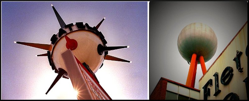
ball blend
A satellite Shopland sign, Katella Ave, Anaheim, California and our beloved silver ball crowning the Fletcher Jones complex: both have a touch of Googie style. Image: www.snapthepix.com and Liz Gannon.

Bluestone columnist and architect CLINTON KRAUSE previously worked in Daylesford before relocating his business to Warrnambool. Clinton explores the architectural styles that gives our region so much character.

Anyone who remembers  the futuristic buildings depicted in the ‘Jetsons ’ cartoons of the late 60’s would be familiar with  ‘Googie’ style.

Emerging in the early 50’s and burning incandescently for just over a decade, this spacey, heroic and showy architecture epitomised post-war American optimism for the future and its inevitable destiny as the pinnacle of human civilisation.

The term ‘Googie’  is alleged to have originated back in the late 1940’s when renowned architect John Lautner designed the groundbreaking ‘Googie’s’ coffee shop in Los Angeles – affectionately referencing the nickname of the client’s wife.

The name became the moniker for a whole trend in design that embraced the ideals of the time around space travel, the automotive industry and America’s future: and we can find examples of it here in the south-west.

The building style was particularly suited to the new roadside architecture of fast food shops , roadhouses, shopping malls and bowling alleys. Gobsmacking rooflines, eyepopping colours and garish symbols all vied for the motorist’s attention along the sleek freeways that sprung up across the country.
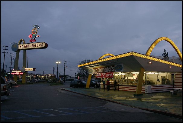
mcdonalds
Early McDonald’s restaurants from the 1950s reflect the ‘Googie’ style, including this one which also features the chain’s original mascot, “Speedee” the chef. Image: www.snapthepix.com

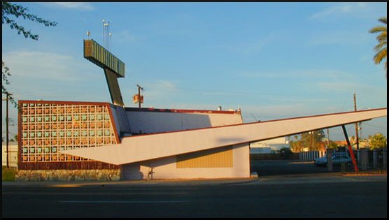
citycenter2 (1)
The City Center Motel (1958), Phoenix, Arizona, is a fine example of the eye-catching designs aimed at luring passing motorists. Image: www.snapthepix.com

Favourite motifs were adopted and applied over and over again – the atomic symbol, the starburst, amoeba and boomerang, domes, saucers and sweeping geometric rooflines and cantilevers.

This exciting architectural trend was explored in Australia and is evident in many structures around Warrnambool, including the Pronto’s building on Raglan Parade, which was designed as a car showroom by Tag Walter.
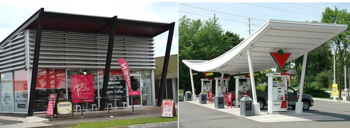
pronto-blend
Prontos in Raglan Parade , designed as a car show room by Tag Walter, epitomises the style’s brash cry for the attention of passing traffic. Images: Bluestone Magazine (left), www.snapthepix.com

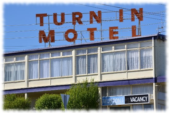
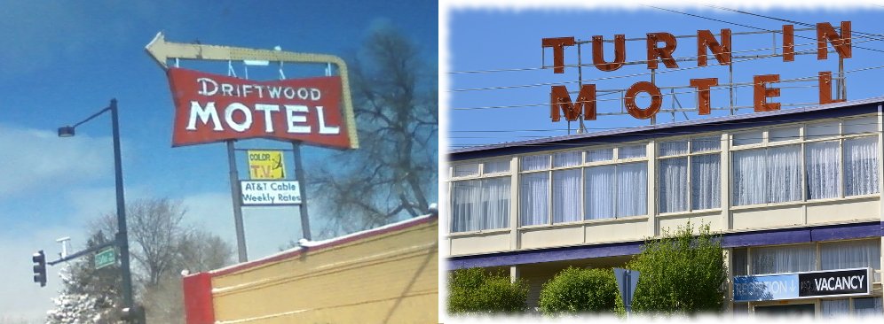
Another example is the iconic Turn In Motel sign that dominated the eastern entrance to Warrnambool when the highway passed by the motel’s front door (it has since been diverted).

And even our beloved Fletcher Jones silver ball pays homage to the era.
turn in blend clinton krause
‘Driftwood’ Motel sign on East Colfax Ave, Denver, Colorado and the signage atop the ‘Turn in Motel’ in Warrnambool. Images: www.snapthepix.com and Bluestone Magazine.

These structures all derive from the Googie aesthetic and often delight in giving  a  ‘cheeky thumbs’ up to the “Establíshment”.

Indeed the style was derided by many architects of the time for being  frivolous, common and lacking in any serious philosophical basis.

The end of the 60’s saw the loss of America’s innocence with the assassination of two Presidents, the debacle of the Vietnam war, and the baby boomers rebellion against the principles of the older generation.

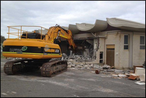
Googie suddenly began to look slightly jaded, comical and irrelevant. Many of the best examples of the style were demolished, butchered or ‘made over’ as developers rejected the high maintenance costs of preserving these monuments to a Utopian idyll.
another bits the dust
Unfortunately many architectural gems of the 1950s are making way for more modern – and mediocre – designs. Image: www.snapthepix.com

As with all architectural misfits, these buildings represent a unique moment in our cultural history and need to be cherished and celebrated for their uniqueness amidst the current sea of prevailing design mediocrity.

Clinton-Krause


A little retro ripper in Port Fairy

An elegant composition of varying roof heights and window geometries.
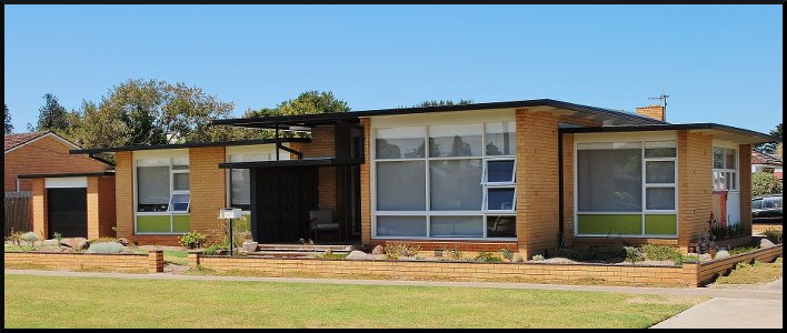
This 1960’s Tag Walter classic in Port Fairy is an elegant composition of varying roof heights and window geometries.

Bluestone columnist and architect CLINTON KRAUSE previously worked in Daylesford before relocating his business to Warrnambool. Clinton explores the mid-century architecture that gives our region so much character, but about which most of us know very little.

Port Fairy is renowned for its charming nineteenth century architecture, but just a street away from the town’s historic centre is a  ‘rediscovered’ retro home that is drawing the limelight away from its older siblings.

For its time, 43 James Street, the house designed by Tag Walter in 1960 for Colin and Maureen Leishmann,  brought a host of revolutionary new design ideas to the sleepy seaside hamlet.

Removal of many large and overgrown trees has revealed, once again, the wonderfully proportioned  facades of the house on the corner of Cox and James streets, with many a passerby declaring that they had never noticed the house before.

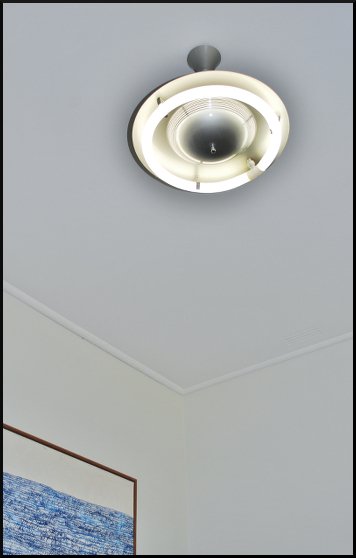
One of a series of original light fittings in the home.

Current residents Liam and Jo Murphy, along with their young family, are only the third owners of a property which remains largely intact and true to Tag’s original plan and design.

Purchased in 2012, the house had suffered more from neglect than the  ‘vandalism’ of successive  ‘improvements’ and the Murphys were faced with extensive water damage to interior walls and floors caused by blocked gutters and deterioration of the almost dead flat metal roof and its poorly fitted skylights.

Carpets were sodden petri dishes of mould and the glass diffusers on ceiling lights were filled to the brim with rainwater.

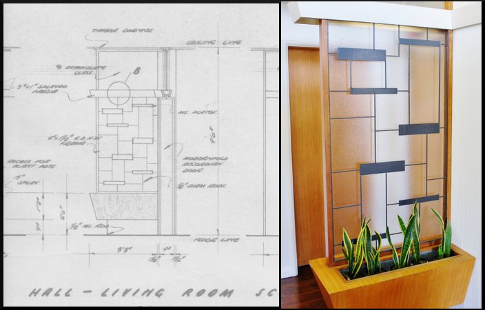
The original plans drawn up by Tag Walter show the eye-catching planter box that greets visitors.
The original plans drawn up by Tag Walter (left) show the eye-catching and quirky planter box that makes for a striking entry.

As enthusiasts of all things retro, Liam and Jo threw themselves into the herculean task of the restoration with gusto, approaching the work with almost reverential attention to detail. Liam, in particular, is meticulous in preserving the period details and interior finishes of  the home.

Setbacks encountered along the way were faced with stoic fortitude: when baby Charlie decided to pick off a large section of the original wallpaper in the nursery, Liam set about carefully reinstating the multitude of tiny scraps and slivers with forensic diligence and considerable success.

The Murphys are also lucky to be in possession of a set of the original plans prepared by Tag which contain detailed drawings for signature installations within the house.

These include a quirky entry planter box – complete with pelmet lighting, an abstract metal privacy screen and ‘stick legs – and a suspended glass display cabinet in the kitchen: a lost feature that will be reinstated sometime in the future.

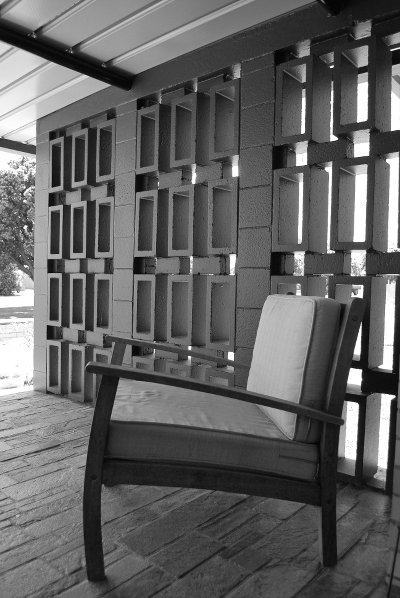
A clever arrangement of blockwork to create maximum impact.

Indeed you could say this house has just about every mid century design trick in the book! Here are just a few:

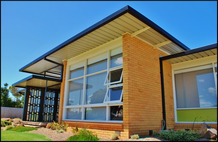
  • Flat rooves with wide overhanging eaves and thin fascias evoke a floating weightless effect;
  • A cantilevered porch roof along with crazy paved steps and a ‘breezeblock’ screen wall make a dramatic entry statement;
  • Individual bricks in walls are stepped out to create a shadow pattern effect;
  • Windows of fixed and opening lime green coloured glass are laid out  in visually pleasing geometrical arrangements;
  • Varying roof heights correspond with interior ceiling heights to differentiate living/entertaining areas and private sleeping zones.

With its expanses of north facing glass – in some rooms wall to wall and floor to ceiling – the house is light, warm and airy and provides a comfortable family friendly home for the Murphys and their three children.

The work undertaken by Liam and Jo demonstrates a sympathetic understanding and love of this fantastic house and it is reassuring to know that another outstanding example of mid-century design in our region is in good hands.

The floating rooflines, expanses of glazing, breezeblock entry screen and bold colours all distinguish the house.

Note: You can read more about the legacy of Tag Walter in my November column here.

When we return in January: Googie 101

Clinton-Krause


The enduring legacy of architect ‘Tag’ Walter

Former Walter family home 47 Henna
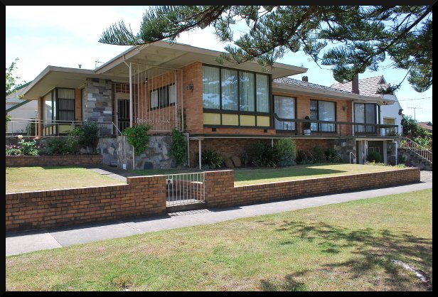
The former Walter family home at 47 Henna St, Warrnambool, which still looks as good as they day it was built in the mid 1950s. Tag Walter also designed and built the home next door, where he started his business.

Bluestone columnist and architect CLINTON KRAUSE previously worked in Daylesford before relocating his business to Warrnambool. Clinton explores the mid-century architecture that gives our city so much character, but about which most of us know very little.

If there is one architect that has made a culturally significant and architecturally definitive contribution to our built landscape here in Warrnambool it would have to be Tag Walter.

William John Taggart Walter – or ‘Tag’ as he was always known – was born in 1909 the son of a builder/developer and one of 5 children. Tag started practice from his own home that he designed and built in 1934 at 49 Henna Street.

This house, a modest pre-war English style bungalow, still stands, but it is the later family home next door at 47 Henna that displays many of the mid-century design elements that the practice was to embrace and become renowned for.

Built in the mid-1950s, this house was a crossover-hybrid of the prevailing tiled hipped roof forms and stepped back ‘waterfall’ room layout, but also played with exciting new design trends.

Oversized eaves, large geometrically partitioned walls of windows, and cantilevered balconies lend the home a slightly ‘Japanese pavilion’ aesthetic. Abstract wrought iron balustrades and panels of crazy stone cladding further enhance the modern signature of the building.

William John Taggart Tag Walter
William John Taggart ‘Tag’ Walter: his designs remain highly sought after. Image courtesy of Robyn Poynton.

pink poodle gold coast
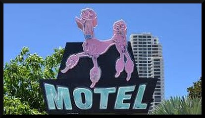
The Pink Poodle motel was one of the most famous on the Gold Coast, but unfortunately only it’s neon sign remains.

Tag brought Bruce Auty into the practice in 1951 and it is surprising how prolific this partnership became.

The pair brought wonderful examples of American 50’s/60’s ‘Googie Style’ to the district – a futuristic design movement redolent of America’s infatuation with the space age, streamlining and car culture. Surviving examples of this distinctive style can still be seen around town in the facades of Mack’s Snacks, Kermonds and Prontos on Raglan Parade – originally designed as a slick, eye-catching car showroom.

Walter and Auty’s work extended throughout the Western District and projects included hospitals, churches, community halls and ongoing development of the iconic Fletcher Jones factory site: masterplanning of the original buildings and gardens having been designed by Tag back in 1948.

A notable interstate commission was the famous Pink Poodle resort on the Gold Coast – a hedonistic motel complex complete with swingin’ bars, bistro, pool and of course a giant, neon, poodle street sign. It was a favourite destination for honeymooners, but while the poodle sign has been preserved, the original building was demolished in 2004.

David Jones ( son of Fletcher ) Family Home. Verdon Street
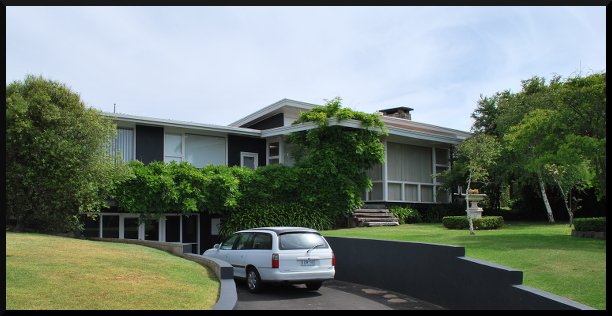
A classic ‘Tag’ design: The former family home of David Jones (son of Fletcher), Verdon St, Warrnambool.

The Walters also found time to raise three daughters who fondly remember their father as an affectionate, kind, generous and meticulous man.

Robyn Poynton recalls that “Dad was always taking me in the car to visit building sites around the district,” and that the family would often attend “opening ceremonies amongst revered dignitaries such as the Premier Henry Bolte”.

Robyn also warmly remembers her sister Joan “doing a training year in Dad’s office on the drawing board, where she would assist with water colour rendering of the perspective drawings”.

Tag worked throughout the sixties, before handing the reigns over to Bruce in 1969. A freak boating accident in 1973 cut short the life of Bruce and brought the practice to a close (but that’s another story…).

Building details. Fletcher Jones Complex.
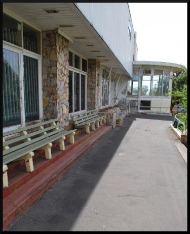
Building details, Fletcher Jones factory complex, Warrnambool.

After retirement, Tag remained registered as an architect and continued to undertake a number of development projects with family members and giving of his time generously to the community right up until his death in 1987.

Walter and Auty were the sole architectural firm in Warrnambool during the 1950’s and 60’s and were leading exponents of Modernism throughout Western Victoria.

Further examples of the firm’s work will be explored in greater detail in later features.

References/acknowledgements: Builtheritage Pty Ltd (Simon Reeves); Warrnambool and District Historical Society; Ms Robyn Poynton (daughter of Tag Walter).

Next Month: A Christmas treat – One with the Lot!

Clinton-Krause


Turning in to the Turn In Motel…

turn in sign
The iconic Turn In Motel was the first motel built in Warrnambool during the 1950s and it has traded ever since. We take a look inside….

Words and pictures: Carol Altmann

[dropcap style=”font-size: 60px; color: #A02F2F;”] I [/dropcap]t is without doubt Warrnambool’s oldest and most iconic motel: a genuine throw-back to the 1950s when the motor vehicle created a whole new form of accommodation for travellers.

The Turn-In Motel sits on what was once the corner of the Princes Highway and Simpson St, with its red, illuminated sign (that originally said only ‘motel’) a beacon to those arriving into the seaside town from Melbourne.

The highway has since been diverted, and there are now far more motels in Warrnambool, but although the Turn In has halved in size, it has never gone out of business and still attracts a steady stream of loyal guests.

“We don’t do any real advertising, apart from the RAA website,” says current owner Ken McRae who, with wife Merrin, has managed the Turn In for the past 16 years.

“The same people just keep coming year after year, they just keep turning up, and the only time they don’t turn up is when they have died: we have lost a couple,” he says.

Indeed at the time of our visit, there was a French couple who were on their third visit and this time they bought some friends from China along as well.

“If we were to go on (the online booking site) Wotif or that sort of thing, we would be over-run I reckon,” Ken says, laughing.

turn in foyer
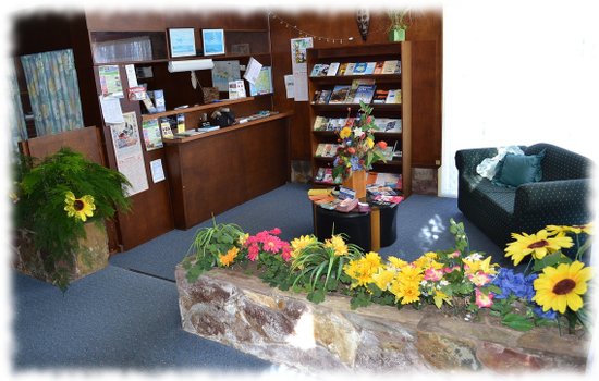
The foyer retains its original reception desk and crazy-paving planter boxes typical of the era.

turn in motel stairs
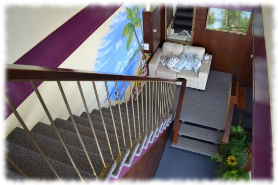
The staircase once led to an in-house restaurant, since converted into a family apartment.

[dropcap style=”font-size: 60px; color: #A02F2F;”] V [/dropcap]isitors are attracted to the budget pricing ($70-100 per night for a couple) and the homestyle feel of the motel, which has retained some of its original fittings from its earliest days, although much has changed.

“When we bought the place, it was in a very bad way. All of the shower stalls had to be replaced, all of the carpets had to be torn up, it was a real mess,” Ken explains.

The motel once had 51 units (it now has 15) and the in-house restaurant is long gone. Even the much-photographed, much-admired Turn In Motel sign is not the original: it disintegrated in the salt air, but the McRae’s invested $10,000 in an identical replacement.

Ken is unsure who built the motel (can anybody help?), but it has the tell-tale crazy paving detail on planter boxes inside the foyer that suggest it may have been the work of Tag Walters, Bruce Auty or John Downie, who specialised in American-inspired designs.

ken mcrae turn in
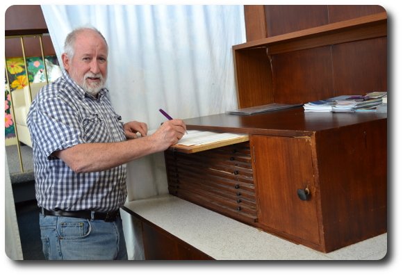
Manager Ken McRae with the original timber filing cabinet used to record bookings. It is still in use.

turn in mirror
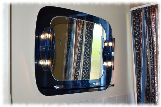
One of the heavy glass retro bathroom mirrors that several guests have wanted to buy…but a motel is attached.

[dropcap style=”font-size: 60px; color: #A02F2F;”] T [/dropcap]he foyer also features the original timber reception desk, together with a set of thin, sliding wooden drawers that keep track of the paperwork for bookings: the McRaes still use it. The original phone switchboard, where calls were manually put through to each room, is also intact, but no longer functional.

One – actually two – precious items that remain in two of the 15 motel units is an art-deco style bathroom mirror made from thick blue and clear glass, with working lights on each side.

Not surprising, Ken says he has had offers from a number of people keen to buy them.

“I say, ‘sure, but they come with a motel attached’,” he laughs.

turn in002
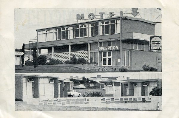
An advertising brochure from the early days of the Turn In Motel. Note the sign says only ‘motel’. Single units were $6 per night, including breakfast. John and Pamela Bowker were the in-house managers.

turn in003
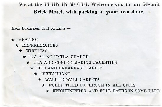
The newly-opened Turn In offered all the latest features, including the original form of ‘wireless’!

[dropcap style=”font-size: 60px; color: #A02F2F;”] A [/dropcap]nd the motel is for sale, with Ken and Merrin keen to retire, although they will continue to live in the house next door for at least the short-term.

“We have done 16 good years. Most motel managers average around five years,” Ken says.

Because of the hard work and around-the-clock availability required, Merran has actually talked some people out of buying the place, which doesn’t sound like a fast track to retirement.

“It has to be the right person: someone who knows what they are getting into, rather than dreaming about what it might be like,” Ken says.

The perfect buyer, perhaps, would be a realist with a penchant for retro who could turn the Turn In back to its full, mid-century self.

Interested?

turn in -gervasconi
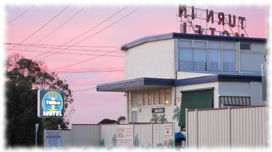
The sun is setting on another chapter at the Turn-In Motel: what will its future hold? Image reproduced courtesy of Lisa Gervasoni.

 [box] Did you know the word ‘motel’ is a hybrid of motor and hotel? The Turn In Motel is on the corner of Simpson and Verdon sts, Warrnambool. You can contact Ken and Merrin on 03 5562 3677.[/box]

[button link=”http://the-terrier.com.au/subscribe-2/” type=”icon” icon=”heart” newwindow=”yes”]Bluestone is aiming for 500 subscribers. If you enjoyed this story, please click here to become one![/button]

newsletter Eat And Drink StonesIf you enjoy retro, you might also enjoy…


Step inside the 50’s Krause house

Exploring our retro architecture: Clinton Krause

Reviving classic Australian furniture by hand: Be Seated

An eye for the bizarre at this Bazaar

Warrnambool aquarium souvenirs a shellshock

New book – “Warrnambool: This is home”