Sign of the times for Mortlake icon
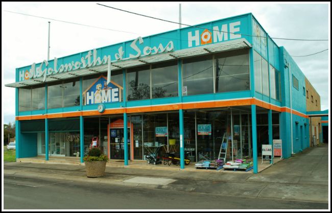
Glass curtain walling to the facade is shaded by a timber sunscreen and deep overhangs (800x507)
The Golsworthy and Sons hardware store in Mortlake is a classic example of 1960s architecture that has remained largely in tact since it was first built. Image: Clinton Krause.

Bluestone columnist and architect CLINTON KRAUSE previously worked in Daylesford before relocating his business to Warrnambool. Clinton explores the architectural styles that gives our region so much character.

Anyone passing through Mortlake would be familiar with the eye-catching facade of ‘Golsworthy and Sons’ Hardware Store at the eastern end of the main street.

Built in 1962, the building is testament to the optimism and buoyancy that arose from the regions prosperity during the post war boom in settlement and farming in the region.

The family dynasty of four generations took over the local hardware shop in 1930 and embarked on successive expansion of both the business and the premises, culminating in the appointment of Melbourne architects Montgomery, King and Trengove to create the cutting-edge, modernist mecca that endures to this day.
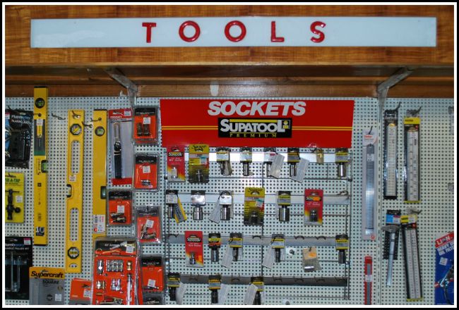
tools sign
Neat as a pin: Custom designed pelmets designate the allocation of goods. Image: Clinton Krause.

More than a thousand people attended the opening ceremony in November 1962, partaking in afternoon tea on the upper floor.

The ‘Mortlake Gazette‘ of that month proudly boasts: “It is doubtful if there is any store in the country the would be the equal of the new building and it compares more than favourably with any Melbourne store”.

Locals, however, were less enamoured, and Eric Golsworthy, third heir of the hardware empire, repeatedly refuted naysayers who claimed that the shop was too big and too expensive for the likes of Mortlake.

It turns out that Eric’s timing was just right and the new business flourished during the good times brought on by the post-war building boom , the influx of residents to the district during the Government’s Soldier resettlement program and the healthy market price for wool.

At one stage the company employed 25 people and the building arm of the business was engaged to build many of Mortlake’s notable public buildings including the Police Station, Ambulance Station, Shire Offices, preschool and infant welfare centres to name just a few.
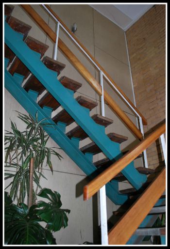
atrium
A plant-filled atrium and stair leads to the upper display floor.

Chatting with the current owners, Rod and Betty Golsworthy, it is clear that the halcyon days are over and that the end of a long and successful family enterprise may be drawing to a close.

I am sitting in Rod’s office and I can’t help but feel that I may be on set for an episode of the classic series, ‘Madmen’.

We are seated in 60’s armchairs surrounded by rich blackwood timber wall panelling at a custom designed timber desk with curvaceous lines and stick legs.

On the floor is grey and blue checked linoleum and out through the glass partitioning, the banks of fluorescent pelmet lights still do their job of visual ‘ razzle dazzle’ across the shop floor.
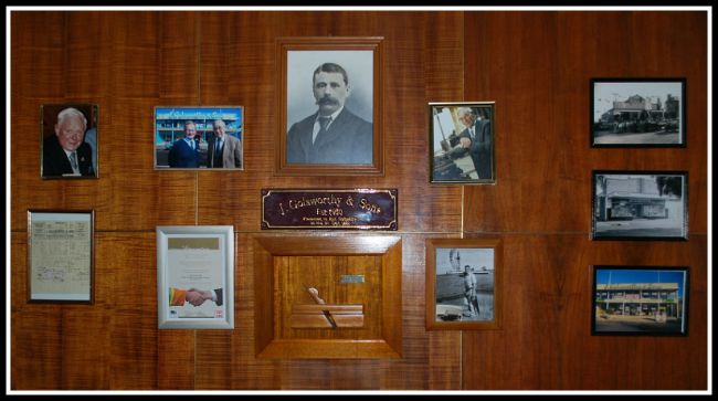
Three generations of the Golsworthy family along with a loyal longserving employee are proudly displayed. (800x436)
Three generations of the Golsworthy family along with a tribute to a loyal, long-serving employee are proudly displayed. Image: Clinton Krause.

Rod proudly shows me the “wall of fame” – a commemoration of the Golsworthy business reign, from James who founded the business in 1930, to Ernest , then Eric and through to Rod.

A photo of employee Arch Grant celebrates 60 years of loyal service. There is a lot of history here to take in.

An exploration of the shop reveals original cabinetry and display stands, building details and even the original architects’ coloured perspective rendering for the proposal.

The stairwell leading to the upper floor is a stylistic statement of floating steps, indoor planter bed and wall panelling all within a glass atrium – very groovy.

The shopfloor is still packed with tools , equipment, hardware and home decor and it is not hard to imagine the days when tradies lined the long counter with their scribbled lists for wire, screws and “2-b-4’s”.

It becomes clear to me while reminiscing with Rod and Betty how both this shop and the Golsworthy family are such a pivotal part of the community fabric and the cultural history of Mortlake.

It is a real delight to discover such an intact “time capsule” of 60’s architecture and design.

In the building itself – the shopfittings, photos , news articles and even the original architectural plans – there is a rich record of an entrepreneurial spirit that has left an indelible imprint on this small rural town.

Clinton-Krause


Glorious remnants of “Googie” groove

ball blend
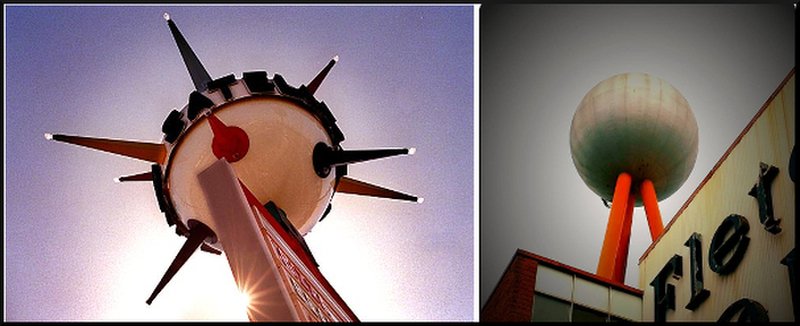
A satellite Shopland sign, Katella Ave, Anaheim, California and our beloved silver ball crowning the Fletcher Jones complex: both have a touch of Googie style. Image: www.snapthepix.com and Liz Gannon.

Bluestone columnist and architect CLINTON KRAUSE previously worked in Daylesford before relocating his business to Warrnambool. Clinton explores the architectural styles that gives our region so much character.

Anyone who remembers  the futuristic buildings depicted in the ‘Jetsons ’ cartoons of the late 60’s would be familiar with  ‘Googie’ style.

Emerging in the early 50’s and burning incandescently for just over a decade, this spacey, heroic and showy architecture epitomised post-war American optimism for the future and its inevitable destiny as the pinnacle of human civilisation.

The term ‘Googie’  is alleged to have originated back in the late 1940’s when renowned architect John Lautner designed the groundbreaking ‘Googie’s’ coffee shop in Los Angeles – affectionately referencing the nickname of the client’s wife.

The name became the moniker for a whole trend in design that embraced the ideals of the time around space travel, the automotive industry and America’s future: and we can find examples of it here in the south-west.

The building style was particularly suited to the new roadside architecture of fast food shops , roadhouses, shopping malls and bowling alleys. Gobsmacking rooflines, eyepopping colours and garish symbols all vied for the motorist’s attention along the sleek freeways that sprung up across the country.

mcdonalds
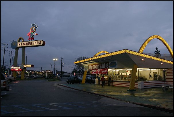
Early McDonald’s restaurants from the 1950s reflect the ‘Googie’ style, including this one which also features the chain’s original mascot, “Speedee” the chef. Image: www.snapthepix.com

citycenter2 (1)
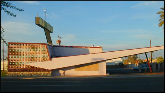
The City Center Motel (1958), Phoenix, Arizona, is a fine example of the eye-catching designs aimed at luring passing motorists. Image: www.snapthepix.com

Favourite motifs were adopted and applied over and over again – the atomic symbol, the starburst, amoeba and boomerang, domes, saucers and sweeping geometric rooflines and cantilevers.

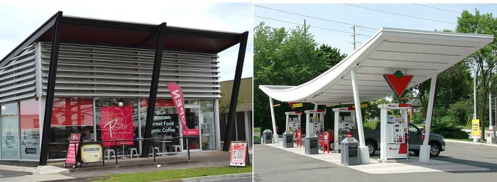
This exciting architectural trend was explored in Australia and is evident in many structures around Warrnambool, including the Pronto’s building on Raglan Parade, which was designed as a car showroom by Tag Walter.

pronto-blend
Prontos in Raglan Parade , designed as a car show room by Tag Walter, epitomises the style’s brash cry for the attention of passing traffic. Images: Bluestone Magazine (left), www.snapthepix.com

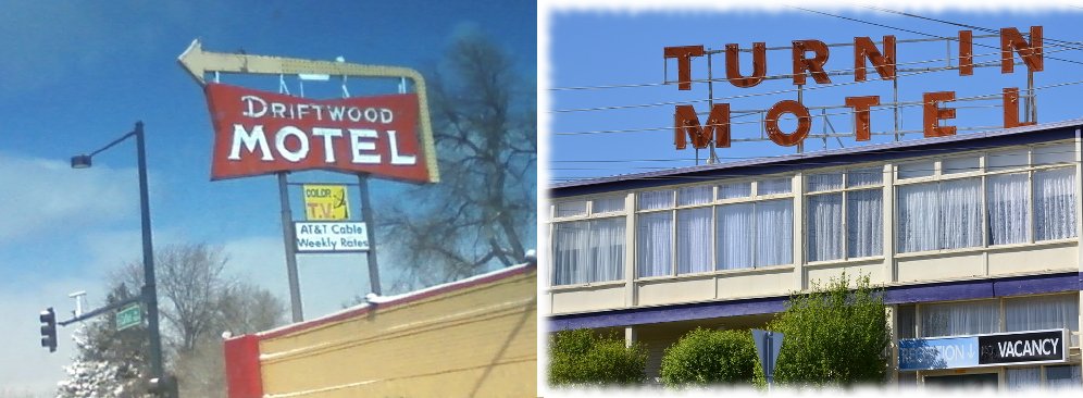
Another example is the iconic Turn In Motel sign that dominated the eastern entrance to Warrnambool when the highway passed by the motel’s front door (it has since been diverted).

And even our beloved Fletcher Jones silver ball pays homage to the era.

turn in blend clinton krause
‘Driftwood’ Motel sign on East Colfax Ave, Denver, Colorado and the signage atop the ‘Turn in Motel’ in Warrnambool. Images: www.snapthepix.com and Bluestone Magazine.

These structures all derive from the Googie aesthetic and often delight in giving  a  ‘cheeky thumbs’ up to the “Establíshment”.

Indeed the style was derided by many architects of the time for being  frivolous, common and lacking in any serious philosophical basis.

The end of the 60’s saw the loss of America’s innocence with the assassination of two Presidents, the debacle of the Vietnam war, and the baby boomers rebellion against the principles of the older generation.

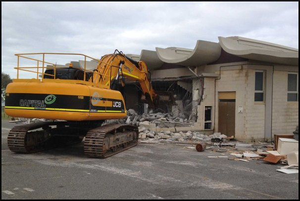
Googie suddenly began to look slightly jaded, comical and irrelevant. Many of the best examples of the style were demolished, butchered or ‘made over’ as developers rejected the high maintenance costs of preserving these monuments to a Utopian idyll.

another bits the dust
Unfortunately many architectural gems of the 1950s are making way for more modern – and mediocre – designs. Image: www.snapthepix.com

As with all architectural misfits, these buildings represent a unique moment in our cultural history and need to be cherished and celebrated for their uniqueness amidst the current sea of prevailing design mediocrity.

Clinton-Krause